Customer Self-Support
Overview
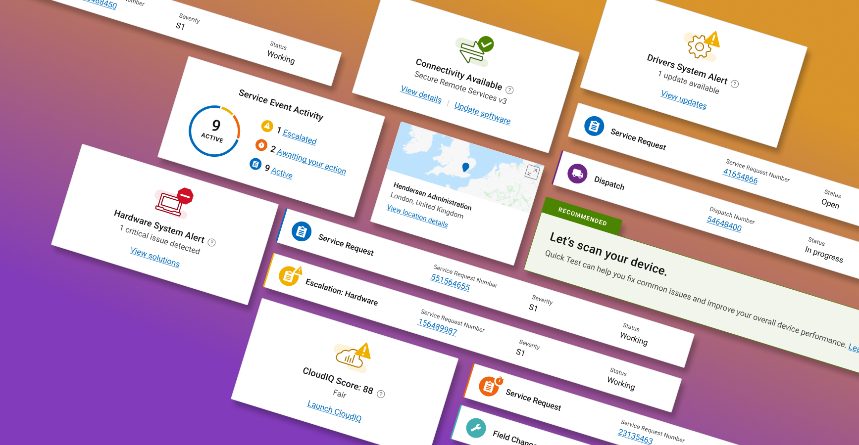
Led a team of 7 designers to integrate the Dell and EMC product self-support suites. We elevated the user experience through a new unified design system while optimizing specific features for disctinct user types. We conducted end-user testing early and often, allowing us to de-risk Day 1 and monitored the live data to address emergent issues quickly.
32% Customer Satisfaction increase
22% Decreased call center volume
166% Increase in diagnostic engagement
The Problem
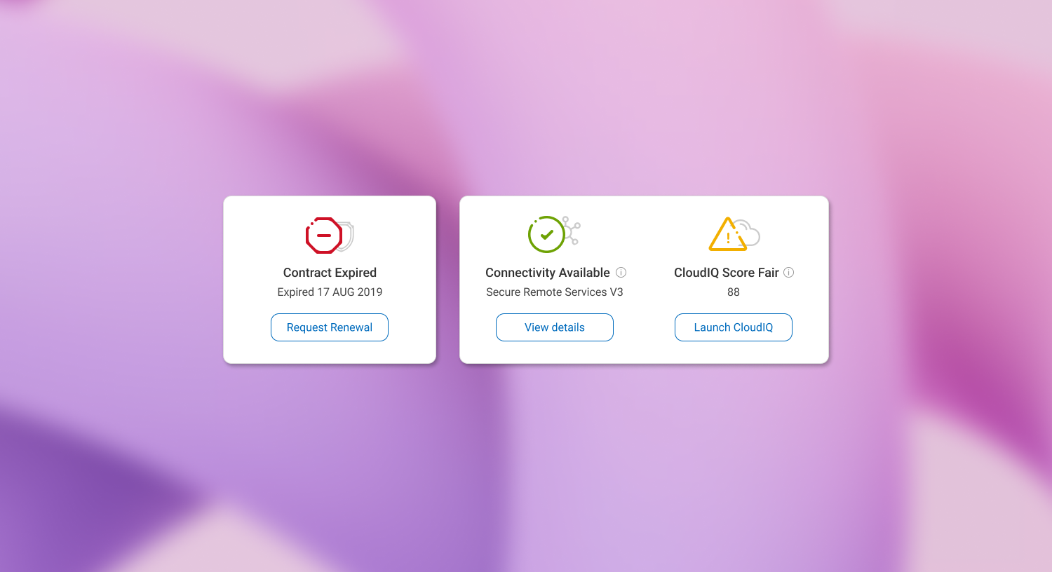
After Dell's acquisition of EMC we received overwhelming feedback indicating that our customers would like to see a fully integrated support experience. EMC traditionally served enterprise users exclusively while Dell served primarily small/medium businesses and direct consumers. We needed to take two vastly different experiences, serving different audiences, and create a unified framework that could accommodate all users, streamline functionalities, and represent under the singular Dell brand. We sought to preserve all functionality that was proven valuable to minimize the negative impact while also identifying and capitalize on any efficiencies and enhancements we discovered through our initial user tests.
The Approach
Setting up a unified framework for both enterprise and consumer users was challenging. I identified structural and architectural improvements through extensive user interviews and live customer data, focusing on the most important tasks to create a more efficient user experience.
I developed three key pillars to drive the project:
Scrolling behavior:
User-testing confirmed users will scroll as long as it isn't excessive. Pages were restructured for depth of content and improved in-page navigation.
Limiting top-level Information Architecture to 5 items:
Legacy pages had too many categories, causing cognitive overload. Research showed people can handle 4-5 items easily. Naviagtion was reduced to 5 categories to lessen cognitive burden.
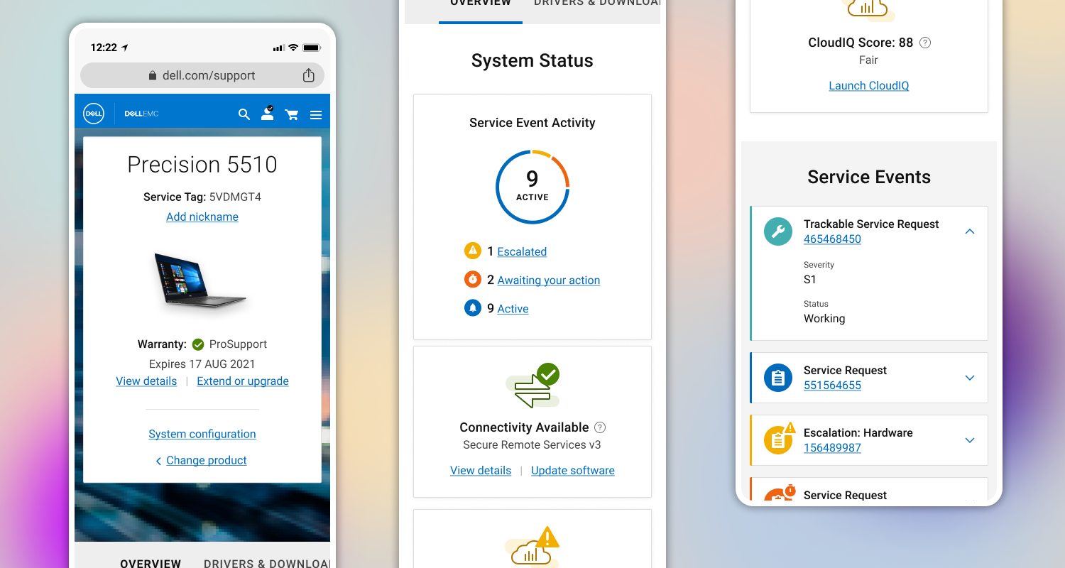
Optimizing for mobile:
Mobile use was low, and EMC pages didn't function well on mobile. Despite low usage, a poor mobile experience was unacceptable for our growing customer base. Optmizing for mobile was a way to ensure a better user experience and matched our vision for behavioral shifts in the future.
The Work
With the pillars in place and given the project's complexity, I knew the team needed structure. At the start, I worked with senior designers for two weeks to develop strategic frameworks. We agreed on a single solution to guide the team. I then directed the senior designers to create a pattern library to improve efficiency. This "single source of truth" allowed junior designers to work confidently and enabled us to produce high-fidelity designs from the beginning.
I collaborated with my business and research partners to establish a regular schedule for usability testing. This frequent testing allowed us to validate our designs through detailed task analysis at regualr intervals to minimize risk. We also held frequent review sessions where all work was peer-reviewed with my oversight. This rapid design process fostered camaraderie within the team, making reviews more casual and collaboration more effective even for business stakeholders.
Landing Page
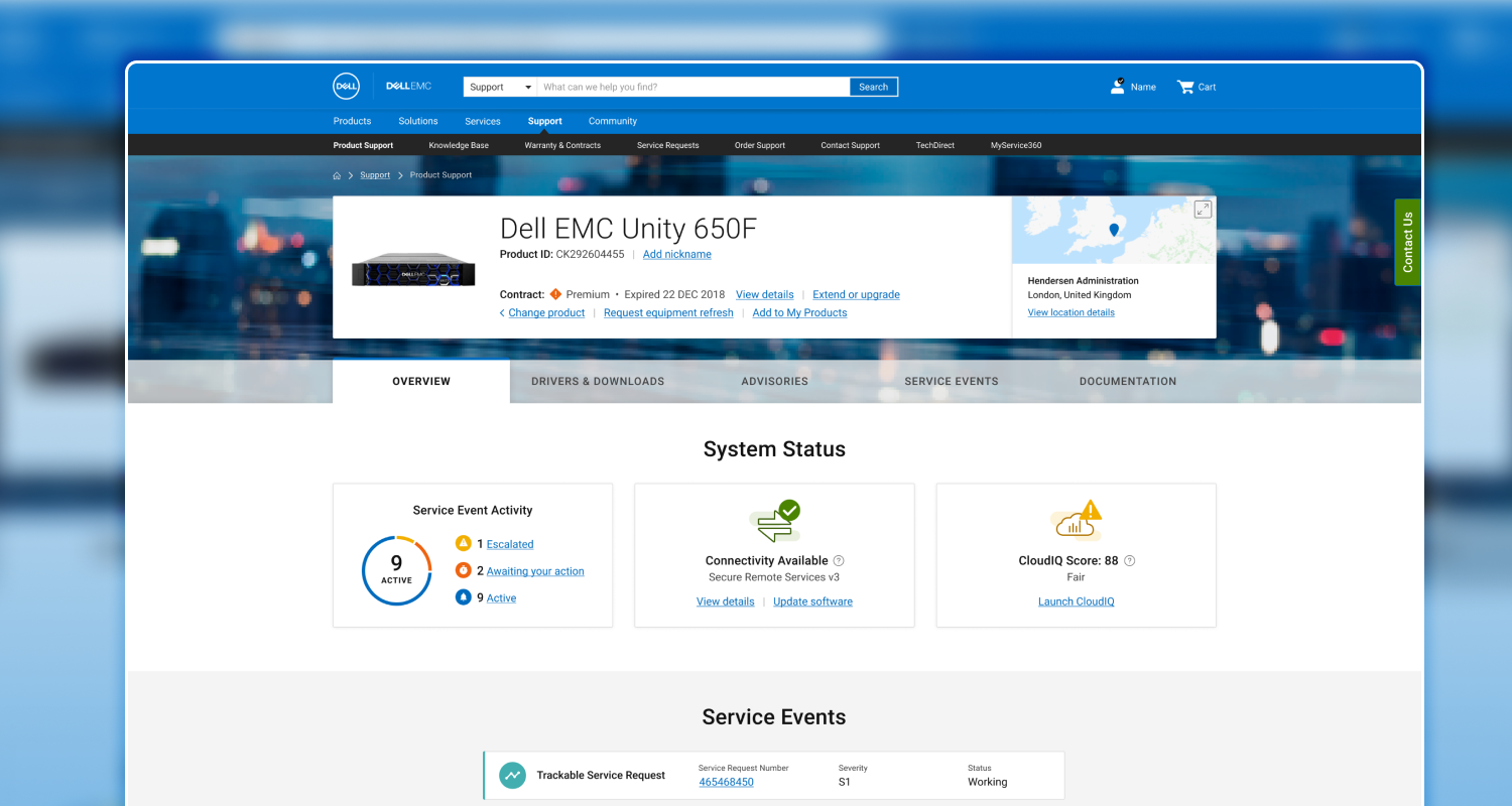
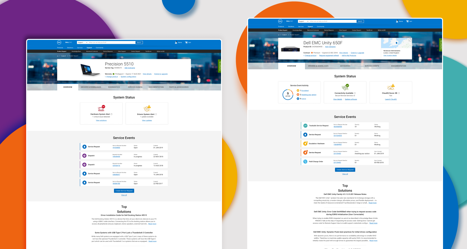
As the architecture was refined, a need grew for a default landing page that served as a wayfinding station for all users. We developed an overview highlighting the most useful information, allowing users to navigate to relevant sections easily. This dynamic, component-based platform could adjust information priorities based on user needs and data availability in real time.
Enhanced History
As the architecture was refined, a need grew for a default landing page that served as a wayfinding station for all users. We developed an overview highlighting the most useful information, allowing users to navigate to relevant sections easily. This dynamic, component-based platform could adjust information priorities based on user needs and data availability in real time.
Efficiency & Alignment
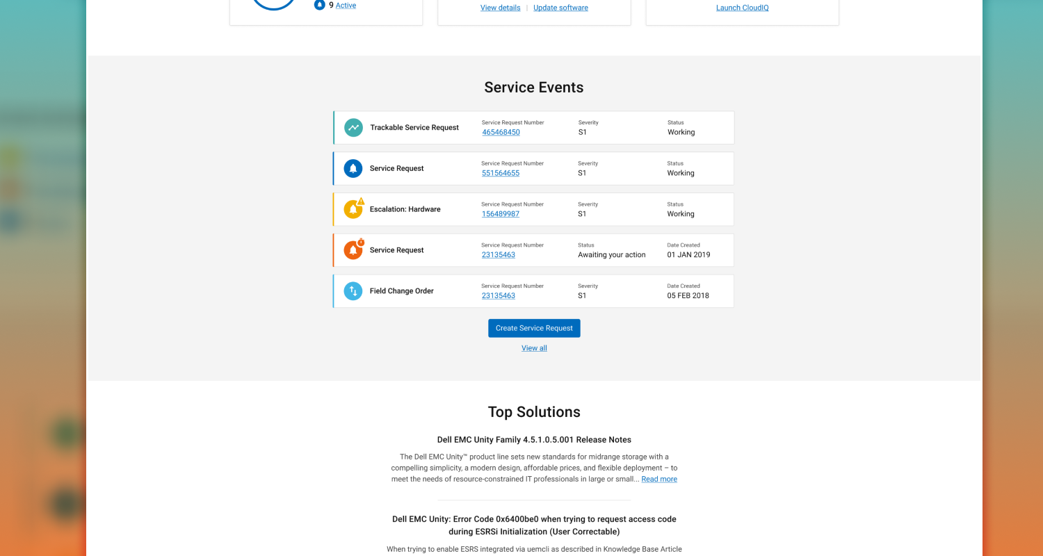
One of our biggest improvements was unifying the Dell and EMC support experiences into a single visual language merging disparate functions into a cohesive system that was durable and aligned with Dell’s brand voice. We combined previously separate areas for active and historical service events, streamlining the architecture and aligning with user expectations while improving data scannability and overall ease of use for enterprise users.
The Results
Our massive redesign effort launched to overwhelmingly positive feedback, both qualitative and quantitative. Users praised the new tools and enhancements for improving their self-help experience, though some areas for further improvement were noted.
Streamlined Content
A key success was the restructured Documentation tab, which combined previously segmented content and added search capabilities. This led to increased engagement and a 32% increase in Customer Satisfaction (CSAT).
"Quick Test" Enhancements
The “Quick Test” feature was redesigned, which uses Dell's on-the-box technology to identify software and hardware issues. Initially, user engagement was low, despite it having the highest CSAT of any support tool. By improving its design and positioning it at the top of the hierarchy, engagement increased by 166% and boosted overall CSAT by 15%.
Proactive Diagnostics
We introduced a new feature that uses the same on-the-box technology to proactively scan users' machines and present potential issues when they visit a support page. This tool was very well received, achieving a 70% CSAT, exceeding the benchmark for new enhancements in the support experience.